How to Choose the Perfect Interior Paint
You find yourself staring at a wall of a thousand slightly different shades of beige while standing in the paint aisle. The pressure of deciding on a paint color seems like a big decision and it can even feel like too much pressure. A space can be totally changed by choosing the correct paint color. It can make a new apartment feel like home or a tiny space feel larger. You can create an environment you love by following this guide, which will help you choose paint colors without any stress.
Start With Your Vibe, Not the Paint Chips
Going straight to the paint store for inspiration can be the biggest mistake people make. Without any preparation, you become lost in endless rows of paint chips. Think about the mood you want to create in your space before you even consider purchasing paint.
Do you want your environment to be serene and comfortable? Or do you require a creative, vivacious environment that motivates you? To find your ideal color, look for color inspiration in areas you already enjoy.
Look through magazines about home décor or make mood boards on Pinterest. Fabric swatches, magazine clippings, and photographs can be used to create tangible mood boards. Finding pictures of rooms that enhance the space and make you feel good is crucial.
A Crash Course in Color Psychology
Our perception and mood are greatly influenced by color. It's about what feels good to you, not just what looks good. When choosing paint, knowing the fundamentals of how a color works can help you. Warm hues like red, orange, and yellow are popular for kitchens and living rooms because they tend to evoke feelings of vitality, coziness, and social interaction. Cool colors like blue, green, and purple, on the other hand, encourage serenity, concentration, and relaxation; they are ideal for home offices, bathrooms, and bedrooms.
Neutrals are also very important for laying the groundwork. While deeper grays and taupes offer sophistication and balance, soft whites and beiges can produce a feeling of cleanliness and openness. Undertones are important to consider as well; a beige with a pink undertone can feel warm, while one with a green undertone can feel more contemporary and fresh.
Knowing these basic concepts will help you match your paint selections to the mood you want to create, be it a vibrant dining area, a serene haven for relaxing, or a multipurpose background that highlights your furnishings and décor.
Thinking About a Color Scheme
Do you remember that old art class color wheel? It's surprisingly helpful for decorating. A monochromatic scheme creates a crisp, elegant appearance by using various tints and shades of the same color.
A monochromatic scheme uses various shades, tints, or tones of a single base color. For instance, a soft sky-blue wall combined with pale blue décor and navy accents produces a sophisticated, multi-layered appearance. For bedrooms or minimalist living rooms where you want a sense of calm without monotony, this elegant yet simple approach is a great choice.
Colors that are next to each other on the color wheel, like blue and green or yellow and orange, are used in an analogous scheme. Our eyes are accustomed to seeing these combinations together in nature; imagine a forest with blue skies and green leaves. Similar styles are useful for establishing comfortable, calming ambiances in nurseries, dining rooms, and family rooms.
A complementary scheme, which combines colors from opposite sides of the wheel, is more vibrant. Red and green, blue and orange, or purple and yellow are examples of traditional pairings. These striking contrasts are ideal for accent walls, artwork, or spaces where you want to make a big impression.
Many designers make use of split-complementary schemes, which start with a base color and pair it with two colors that are adjacent to its opposite, to achieve greater balance. This provides contrast without being overly dramatic. Orange-red and orange-yellow accents, for instance, add vibrancy to blue walls while maintaining an approachable vibe.
Knowing these basic color relationships allows you to try new things without making "mistakes." The color wheel can help you choose a scheme that gives your room a deliberate and unified feel once you know what kind of mood you want—calm, energizing, or elegant.
The Secret Power of Neutrals and Their Undertones
There's a reason why neutral hues like white, beige, and gray are so popular. They provide the ideal background for highlighting your artwork and furniture. However, neutral does not equate to dull; the selection process is more intricate than you may imagine.
There is a subtle undertone in every neutral, and these color undertones are crucial. While some grays may lean brown (warm), others may lean blue (cool). Because of these subtleties, a color may appear ideal in a store but completely incorrect on your wall. Because there are hundreds of different shades of white paint, even picking one can be difficult.
Work With Your Existing Elements
There are already items in the room to take into account, unless you are starting from scratch. Your choice of paint color needs to complement your fixtures, furniture, and flooring. The room should feel unified rather than fragmented.
Pay attention to your room's fixed features, such as the brick fireplace, kitchen cabinets, countertops, and flooring. Each of these items has its own undertones and colors. Cool gray paint might look out of place on warm oak floors, but warmer beige or greige might work better.
A favorite rug, a work of art, or even your window treatments are examples of objects you can use as inspiration. Start by identifying a color that appears in the design of your area rug or curtains. This can assist you in selecting a color scheme that complements your existing decor.
How Your Room's Lighting Changes Everything
The most important and yet most overlooked factor in paint color selection is lighting. Different rooms can have entirely different looks from the same color. You won't get what you see in the store under the harsh fluorescent lights at home.
Working With Natural Light
The amount of natural light that enters your room is influenced by the orientation of your windows. The color of your room is also affected by the amount of natural light. Before deciding, observe how the light changes during the day.
Soft, indirect light with a cool, blueish tint comes in to rooms facing north. Cool colors will be enhanced by this light, while warm colors may appear somewhat muted. Any color appears more vibrant in rooms that face south because they receive warm, intense light for the majority of the day.
East-facing rooms get bright morning light that can appear slightly warm. In the afternoon, the light becomes cooler and more indirect. West-facing rooms are darker in the morning but are lit by the warm, soft glow of the evening sun, which greatly enhances reds, oranges, and yellows. Partnering with a bathroom remodeling company in Montgomery County, PA, allows you to select paint colors that brighten dark spaces and complement your flooring or built-ins.
Don't Forget Your Light Bulbs
After the sun sets, your lighting fixtures become extremely important. Warm, yellowish light from older incandescent bulbs can mute cooler hues while enhancing reds and yellows. Although LED bulbs are far more adaptable, you must check their color temperature.
Kelvins are used to measure LEDs. The U.S. Department of Energy claims that soft white light bulbs emit a warmer light and have a lower Kelvin rating. The appearance of your paint can be significantly changed by using daylight or cool white bulbs, which have a higher Kelvin rating and cast a clear, bluish light.
A Practical Guide to Choosing a Paint Color
You're ready to get down to business after you've decided on your lighting and found your inspiration. This is the point at which you test your research. You can get it right with a little patience and a few basic guidelines.
Use the 60-30-10 Design Rule
This is a classic interior design guideline that helps you create a balanced color palette. It's a simple way to give your room a polished and intentional look. You don't have to follow it exactly, but it is a kind of blueprint for beginners.
The rule breaks down your color choices like this. 60% of your room should be your main color, which is usually your walls. 30% should be a secondary color found in your furniture, rugs, or an accent wall. The final 10% is your accent color, used in small doses on things like throw pillows and decor.
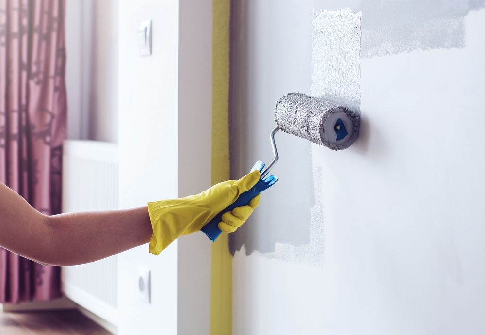
Never, Ever Skip the Paint Sample
The importance of testing paint colors on your real walls cannot be overstated. Although they are not exact, those little paper paint chips are helpful for reducing the number of choices. The appearance of real paint in the lighting of your house cannot be replicated by ink and paper.
Buy sample pots of your top two or three options from one of the paint manufacturers. Many retailers also allow you to order samples online. Before purchasing gallons of paint for your do-it-yourself projects, it's best to swatch the paint in the area.
For every color on your wall, paint a large square that is at least two feet by two feet. Make sure to paint samples on walls that are impacted by different lighting sources.
Using this technique, you can observe how the color appears on various walls. Spend a few days living with these sample squares. To fully understand how the color behaves in your space in real life, observe them in the morning, afternoon, and at night while the lights are on.
A Note on Buying Paint Online
For convenience, a lot of people now decide to order paint online. Although this is a fantastic choice, there is a serious catch. The shade you see online might not be the one that shows up at your door because phone screens and monitors are not color-accurate.
To see the color in your house, always order samples first. You can place your order with confidence after selecting your ideal color from a physical sample. When purchasing paint online, this is an essential step.
Finally, Pick the Right Paint Sheen
Choosing the right color is only half the fight. The level of shininess, or paint sheen, influences the color's appearance and the finish's durability. Selecting the appropriate sheen is equally as crucial as selecting the appropriate shade.
It is easier to clean when the sheen is higher because it reflects more light and is more durable. But it also displays all of your wall's blemishes and cracks. For a glossy finish to look good, the surface should be as smooth as possible.
- Appearance: No shine, hides imperfections
- Best For: Ceilings, adult bedrooms, low-traffic areas
- Durability: Low
- Appearance: Very low sheen, soft finish
- Best For: Living rooms, hallways, dining rooms
- Durability: Medium
- Appearance: Soft, subtle glow, easy to clean
- Best For: Kitchens, bathrooms, trim, high-traffic areas
- Durability: Medium-High
- Appearance: Noticeable shine, very durable
- Best For: Trim, doors, cabinets, bathrooms
- Durability: High
- Appearance: Very shiny, glass-like finish
- Best For: Furniture, front doors, statement trim
- Durability: Very High
An eggshell or satin finish is a dependable and secure option for the majority of rooms in an apartment or dorm. They provide a nice balance between ease of cleaning and aesthetic appeal. For bathroom walls, use a semi-gloss because it resists moisture and humidity well.
A semi-gloss or high-gloss is often used for door colors and trim to make them stand out and for durability. For a bedroom color, a flat or eggshell finish provides a soft, restful appearance. The right sheen completes the look you're going for. If you’re planning a full bathroom renovation, working with a bathroom remodeling company in Bucks County, PA, can help you coordinate paint colors with new fixtures, tile, and lighting.
Making Your Final Paint Choice with Confidence
The process of choosing a color doesn't have to be difficult. You're ahead of the game if you start with inspiration, learn a little color theory, and pay careful attention to the light in your space. Don't forget to take into account your current flooring, furniture, and even wood stain finishes.
Always test your final choices with large paint samples before you pick paint for the entire room. This is the single most important step interior designers and color experts recommend. With this simple plan for how to pick interior paint colors, you can confidently choose a room paint that creates a space that truly feels like your own. Ready to transform your home? Contact A&Z General Contractor today and let our team bring your perfect paint choice to life.


